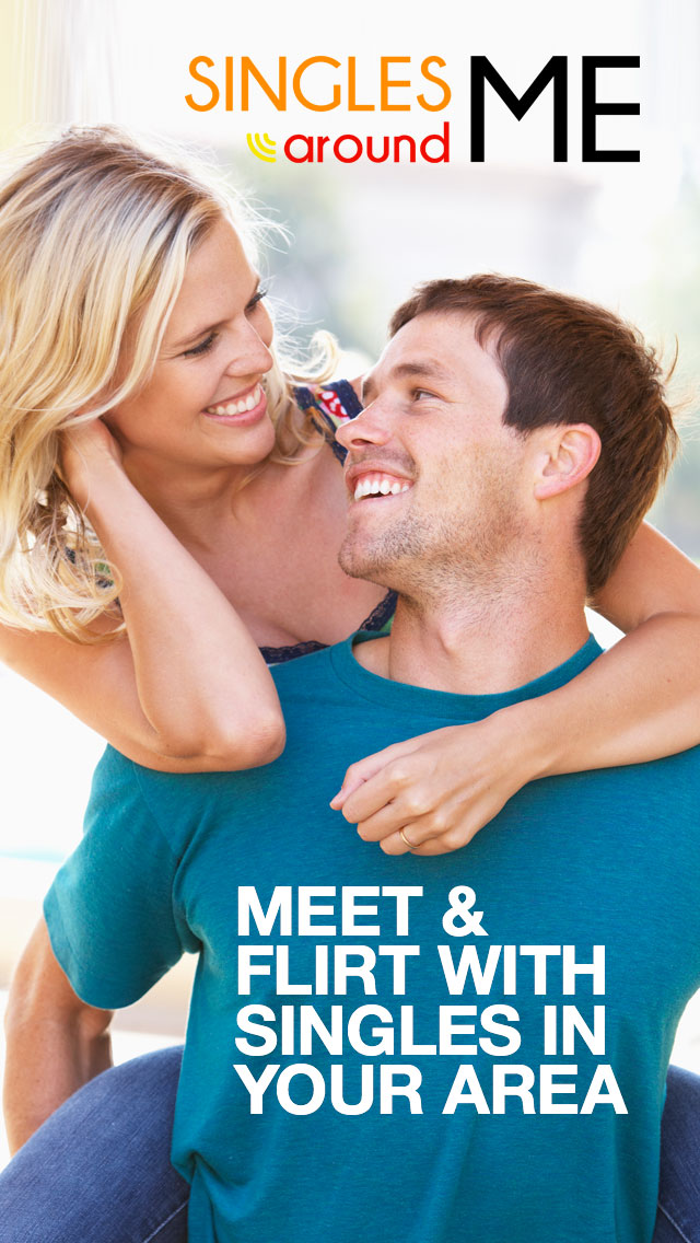
1. I love the bright colors, very defined app screen. Showing big smiles on the face, eye contact with one and another.
5. More concentrated on the couple, and not on the surroundings. The image is more zoomed in on the bodies and the faces. So this feels more personal and intimate.
6. It looks more professional and less cluttered. The second option has so much going on, it's kind of overwhelming to look at, and it looks cheap.
It's also kind of hard to read the white text, as the background behind it is very busy and distracting.
7. It is how I would like to start a relationship, it is less pushy with expectations. The couple looks like they are having fun.
9. It is more appealing because of the look and smile of the guy and girl in the screen
10. more bright, clear, not crowded, appropriate information
11. Dating need privacy, Option 1 seems that they are enjoying their date at a private and comfortable place. Option 2 looks like its wedding time.
16. Less clutter
22. The lighting is brighter and more welcoming, the people also look happier.
25. The text is easier to read and the people are the main center piece of the picture
26. It shows more of the couple and I like that it has less font
27. Option 1 is cleaner than option 2 and has a brighter, more attractive colour palette. I like its simplicity which also contributed to a higher degree of readability in comparison to option 2.
32. I like the bonding between the 2 people. I feel that i will find a pretty girl friend and be able to bond like the model on the display. Option 2 seems to be too logical and you cannot put logic in love
34. The picture is brighter, and visually more eyecatching.
35. They are young and look more natural looking. The other option looks like a magazine cover.
36. The other one was too busy and was very distracting for the eyes
37. The second one looks a bit too noisy
41. looks more genuine
42. Option 1 looks more warm and fun than the option 2.
43. Looks romantic the second one looks like a film cover
49. Looks romantic the second one looks like a film cover
51. The first background is more appealing, i think more about joy than the second one. The text is also more suiting, bold and clear, where as the second image is a bit hard to see the text, due to its size, color and background
29 Responses to Option B
29 people chose B as their choice
2. Sounds like more fun.
3. Option 1 looked too much like a movie poster from a Rom-Com
4. It's a lot more appealing and friendly looking.
8. The second option looks more like a real couple whereas the photo in the first option looks like a stock photo.
12. It is a little less fake looking. It is more of an organic picture
13. Option 1 is more like a movie trailer
14. looks better
15. It shows a very romantic moment with a good scenery.
17. Looks more classy. Nicer background
18. less focused on random couple, more focused on the options available for ME
19. It has options that I can interact with instead of looking like a loading screen.
20. While both are okay, I like the vibrancy of the second option. Plus, the individuals featured are on 'equal footing', rather than one on the back of the other. It's also visually more interesting to have the couple in a beautiful location... more romantic, while option 1 had a bit of a country bumpkin vibe.
21. Option 1 looks like one of those ads you see which will give you a virus, Option 2 looks clean, professional, and easy to navigate
23. I liked how there were options to sign in and location privacy listed
24. The options presented on the screen create more opportunity in ones mind and make for a more appealing initial interface
28. Liked the word usage and picture used.
29. There's more information on it, it gives a better idea of finding people around you, and seems more about meeting someone to have a relationship rather than just to hook up.
30. The couple is not so in your face. There's some stuff going on around the couple.
31. Eye candy.
33. advertising privacy -
38. Option 1 is a more generic image. These people could be anywhere, and there's nothing really romantic about the image. Option 2 has teh couple about to kiss, in a city that looks European, with cobbled streets and old buildings, and there's heart-shaped balloons. It immediately brings to mind romance in a way that Option 1 doesn't.
39. Option 2 looks like two people who did not know each other before meeting for the first time or first few dates at a random place in the city. It fits the dating app theme. Option 1 could be an ad for a married couple about anything. They seem to familiar for a dating app.
40. I prefer the image, and also I don't like the wording 'Meet & Flirt' in Option 1, it feels juvenile for me.
44. The color theme looks better than the first one and suits a dating app more than the first option. Also the options available looks good on the screen.
45. I like the idea of having the buttons on the very first page of the app. No waste of time. I also find the image more appealing, I like the background and red balloons. I also like the idea of having "See Singles Now" without being signed in. From a marketing perspective, it might help for customer acquisition.
46. It feels more like an actual app page. Option 1 doesn't feel like it is an app page because there are no controls or buttons. Also, I like the symmetry of Option 2's image better.
47. Seeing the buildings around the people emphasizes the "around me" part, making me thing of the singles in my neighborhood in the city. The models are also much less generic looking to me.
48. I feel like although option one is more eye grabbing it feels like a pop up add, option two on the other hand looks professional and is far superior between these two options with an easy layout that’s well balanced, it looks more inviting. With that being said I think it can be improved on.
50. I like the Location Privacy. I also like the fact that the people posing in the photo are ethnically diverse looking
Demographics
Manage pending orders and track invoices.
Gender (Personal)
Age Range (Personal)
Share Your Results
Anyone with the following URL can see these poll results.